Simplifying vaccine scheduling with progressive disclosure.
Redesigning a multi-step scheduling flow so users could focus on one decision at a time, reducing drop-off and support burden across web, iOS, iPad, and Android. Getting a vaccine shouldn't feel stressful, and this redesign made sure it didn't.
The original scheduling flow showed all steps at once, overwhelming users before they'd made a single decision. Drop-off was high, and confusion was generating avoidable support requests that added real cost and friction for everyone involved.
Contributed to discovery and early design on v1, then took full ownership of the redesign, rethinking the flow structure, interaction model, and cross-platform experience from the ground up.
Improved scheduling completion rates, a meaningful reduction in support contacts, and a single consistent flow running across web, iOS, iPadOS, and Android. Every user, on every platform, gets the same clear experience.
How I approached it
The redesign started with a simple question: what does the user actually need to decide right now?
Understand where users dropped off
Reviewed funnel data and support contacts to pinpoint where users were abandoning the flow and what questions were generating confusion.
Restructure the flow
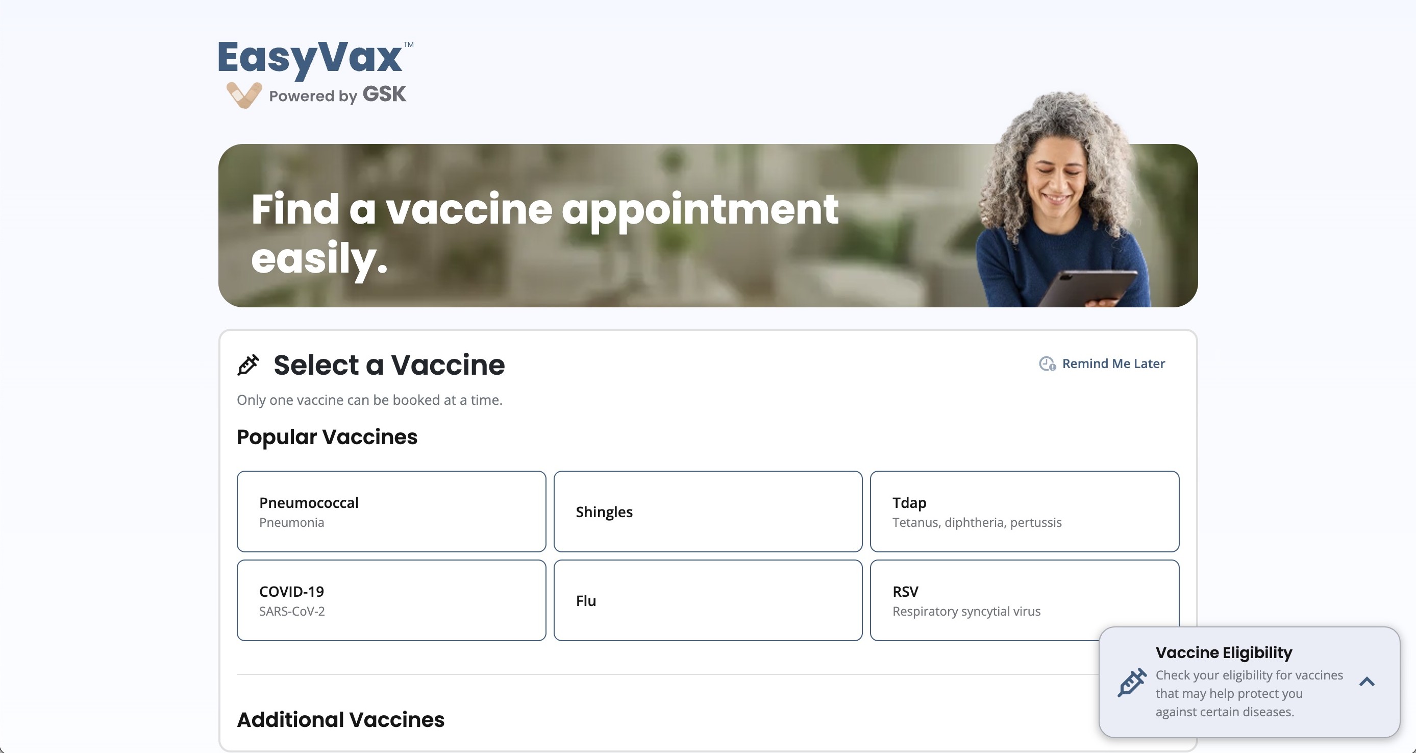
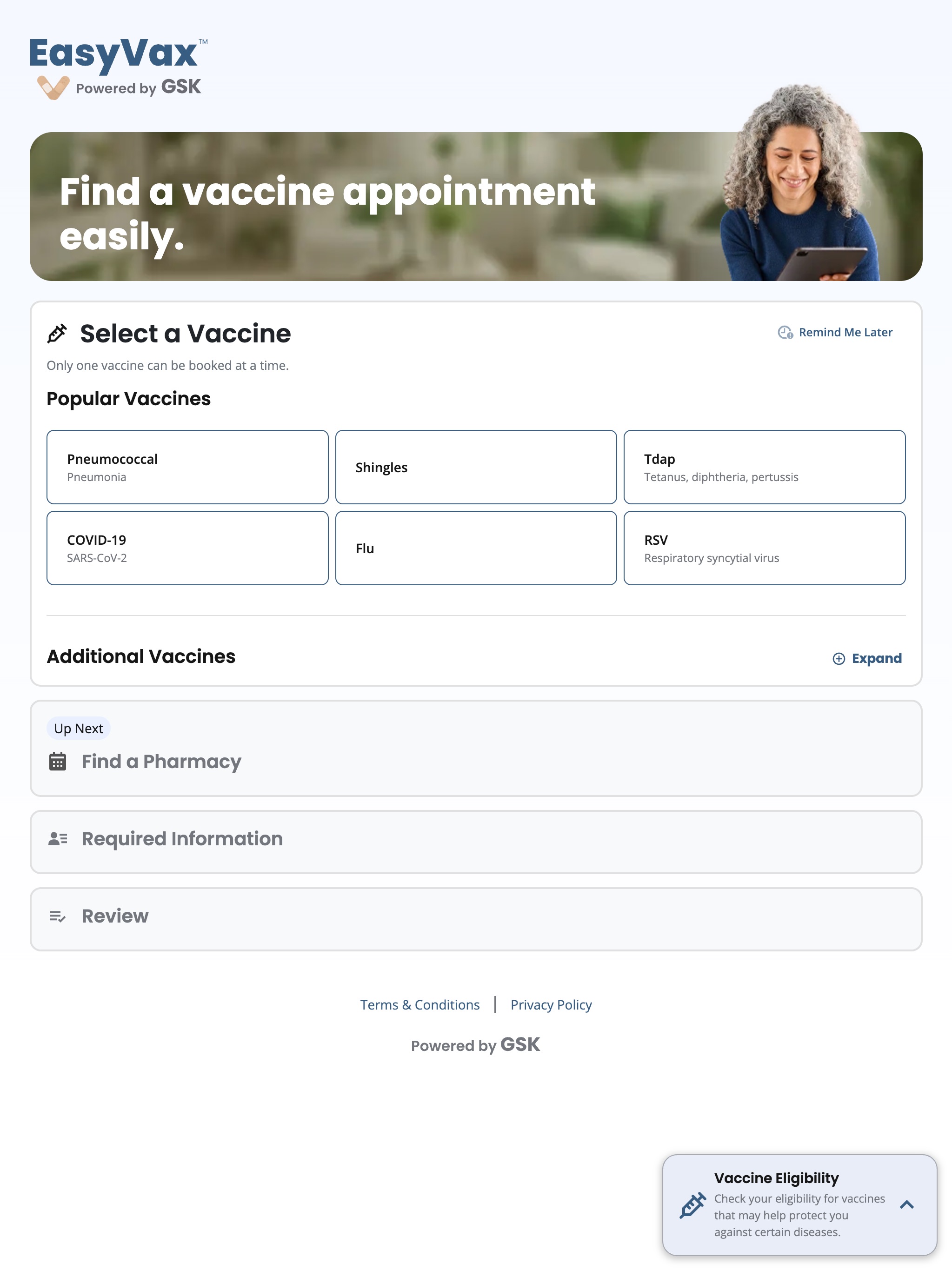
Shifted from a "show everything" model to a sequenced accordion: one active step at a time, with upcoming steps visible but locked until they're relevant.
Cross-platform consistency
Designed the interaction model to feel native on each platform, web, iOS, iPadOS, and Android, while keeping the core flow and mental model consistent across all four.
Test and iterate
Usability tested with real users across device types. Validated that the progressive structure reduced perceived complexity without hiding information people needed.
Decisions that mattered
Show upcoming steps, but keep them locked
Rather than hiding future steps entirely, the redesign keeps them visible as collapsed, inactive panels. Users can see where they're going without being asked to act on everything at once.
Lead with vaccine selection, not personal information
The original flow opened with required personal fields, which felt clinical and high-stakes right out of the gate. Moving vaccine selection to step one gave users an easy win before we asked for anything personal.
One interaction model, four platforms
Rather than designing four separate flows, I established a single interaction model and adapted the presentation layer for each platform. Every user, regardless of device, goes through the same clear journey.
What changed
The redesign had measurable impact on two fronts. Full metrics are available in the detailed case study.
Platforms shipped with a single, consistent interaction model: web, iOS, iPadOS, and Android. One clear mental model, adapted appropriately for each device.
Scheduling completion rates improved meaningfully after launch. Users who started the redesigned flow were significantly more likely to finish booking compared to the original version.
A measurable reduction in support contacts tied to the scheduling flow after launch. Users were completing the process on their own, without needing to call or ask for help.
Progressive disclosure turned a form that felt like a wall of questions into a flow that felt manageable, without hiding or removing any required information from the process.
Have a complex flow that's losing people? Let's fix it.
I love talking about design and hard problems. Drop me a line or connect on LinkedIn. I'd genuinely love to hear from you.