An iPad-native tool for field representatives.
Designing a tablet dashboard for healthcare reps who needed real information, in real time, on the road.
Equip a fleet of healthcare field reps with a purpose-built iPad tool, one designed for the real conditions of on-site work in clinics and hospitals, not a desktop experience crammed onto a tablet.
Lead UX designer. I owned research, information architecture, and end-to-end interaction design for the iPadOS experience, including field ride-alongs to understand how reps actually work.
A tailored dashboard that reps adopted as their primary tool. Core workflows compressed from 6+ taps to 2-3, and field locations with poor signal stopped being a barrier to getting work done.
The challenge
Healthcare field reps work in clinics, hospitals, and offices. Short windows of time, complex information, constant context-switching. Their tools have historically been built for desks, not for the people actually using them in the field.
Working with a healthcare company, we set out to design a tailored iPad experience that gave the field team a tool actually shaped around how they work: portable, glanceable, fast to navigate between accounts, and credible enough to pull out in front of a clinician without any explanation needed. Every person on that team deserved a tool that worked as hard as they did.
The brief wasn't just "make a tablet version of the desktop tool." It was: design what these reps would have asked for, if anyone had ever thought to ask them. We asked. Then we went on ride-alongs to see for ourselves. That research was the foundation of everything that followed.
How I approached it
The work hinged on contextual research. We needed to understand the actual moment a rep would use this thing.
Ride-alongs & interviews
Time with reps in the field surfaced the real problems. Too many taps, brittle offline behavior, and info buried where they couldn't reach it quickly.
Information architecture
Restructured the data model around the rep's mental model: by account, by visit, by next action. Instead of just mirroring the back-end schema.
iPadOS-native patterns
Using native interactions like split views, drag-and-drop, and contextual menus, so the tool felt at home on the device. Not like a web app in a frame.
Test with real reps
Prototypes back in front of the same field team. Did tasks that used to take six taps now take two?
Decisions that mattered
Designing for one-handed use, not two
Reps often hold the iPad in one arm while they're talking to a clinician. Critical actions were placed within thumb-reach on the non-dominant side, and destructive actions like delete or send were placed deliberately further away. This is a small ergonomic detail with a big real-world impact for someone using the tool in a busy clinic hallway.
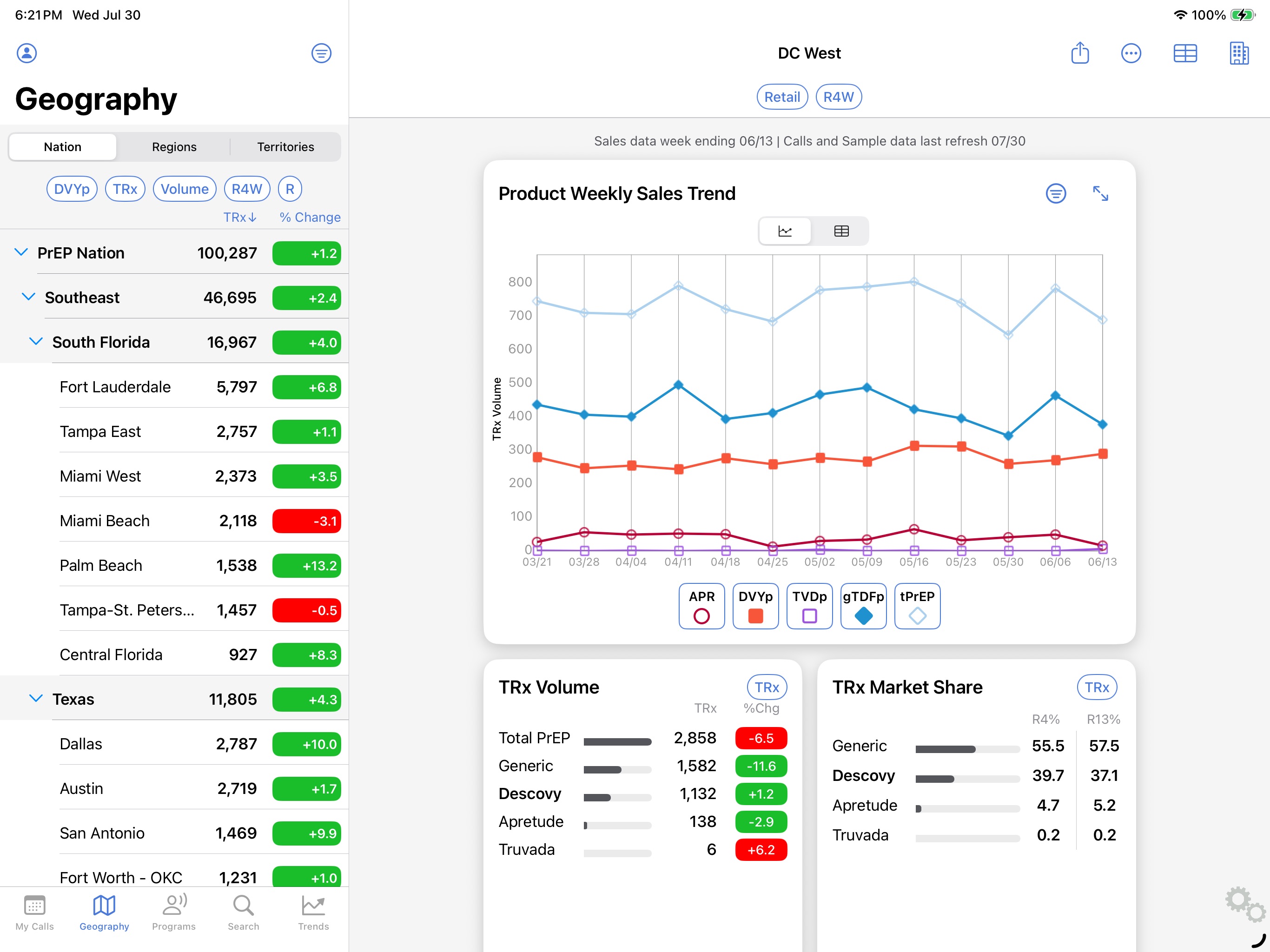
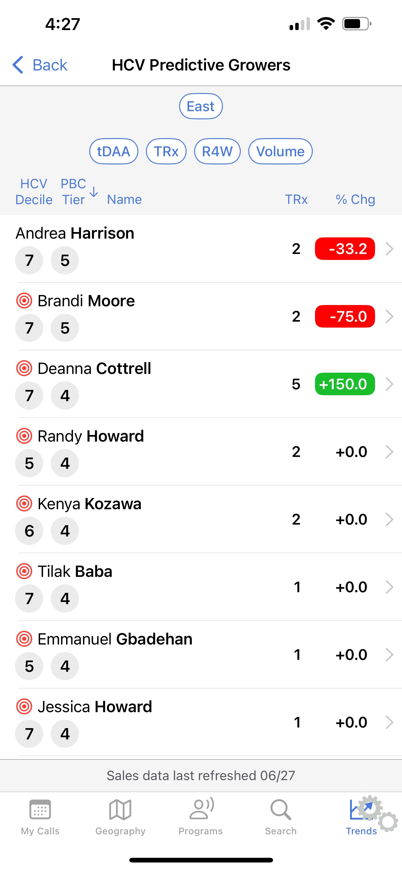
Glanceable over comprehensive
The default dashboard view is intentionally sparse. What does this rep need to know in the next 30 seconds? That's what the surface shows. Detail is one tap away. Keeping the default calm and focused was one of the most important design decisions we made, and the one we had to defend the most in reviews.
Offline-first, sync quietly in the background
Field locations have unreliable signal, and we designed around that reality from the start. The interaction model assumed offline as the default state, with sync as a background process the rep never has to manage. That decision removed a constant source of friction and made the tool actually dependable in the field.
Information architecture built around the rep's mental model
The original data structure was organized around the back-end schema, which made sense to engineers but not to reps. We restructured it around how reps actually think: by account, by visit, by next action. That IA shift was the single biggest driver of task-completion improvement we saw in testing.
What changed
Specific metrics covered in the full case study Public-facing highlights:
Reduction in taps for core workflows compared to the prior tool. Tasks that used to take 6 or more taps now took 2 to 3, based on usability testing with the same field team.
Reps dropped their old workflow and switched to the new tool as their default. That's the truest signal a field tool is doing its job: people actually use it when it counts.
Reps described it as feeling like "an actual iPad app, not a web page." That credibility mattered in front of clinicians. Pulling out a polished, purposeful tool changes the dynamic of a sales visit.
Field locations with poor or no signal stopped being a source of frustration. Sync happened quietly in the background, and reps stopped having to think about connectivity at all.
What I'd carry forward
The ride-alongs were worth more than any number of stakeholder interviews. Going into the field with these reps changed what we built in ways I couldn't have anticipated from a conference room. For any field-tool project, I'd treat that research as non-negotiable from day one.
Using iPadOS interactions like split views, drag-and-drop, and contextual menus fundamentally changed what the tool felt like in someone's hand. It went from something they tolerated to something they trusted. That's a UX decision, not a styling preference.
Resisting the pull to surface everything made every screen more useful. The reps didn't need more information. They needed the right information at the right moment, with nothing else in the way.
Got a field team that deserves better tools? I'd love to hear about it.
I love talking about design and hard problems. Drop me a line or connect on LinkedIn. I'd genuinely love to hear from you.