Making AI-generated insights something people actually act on.
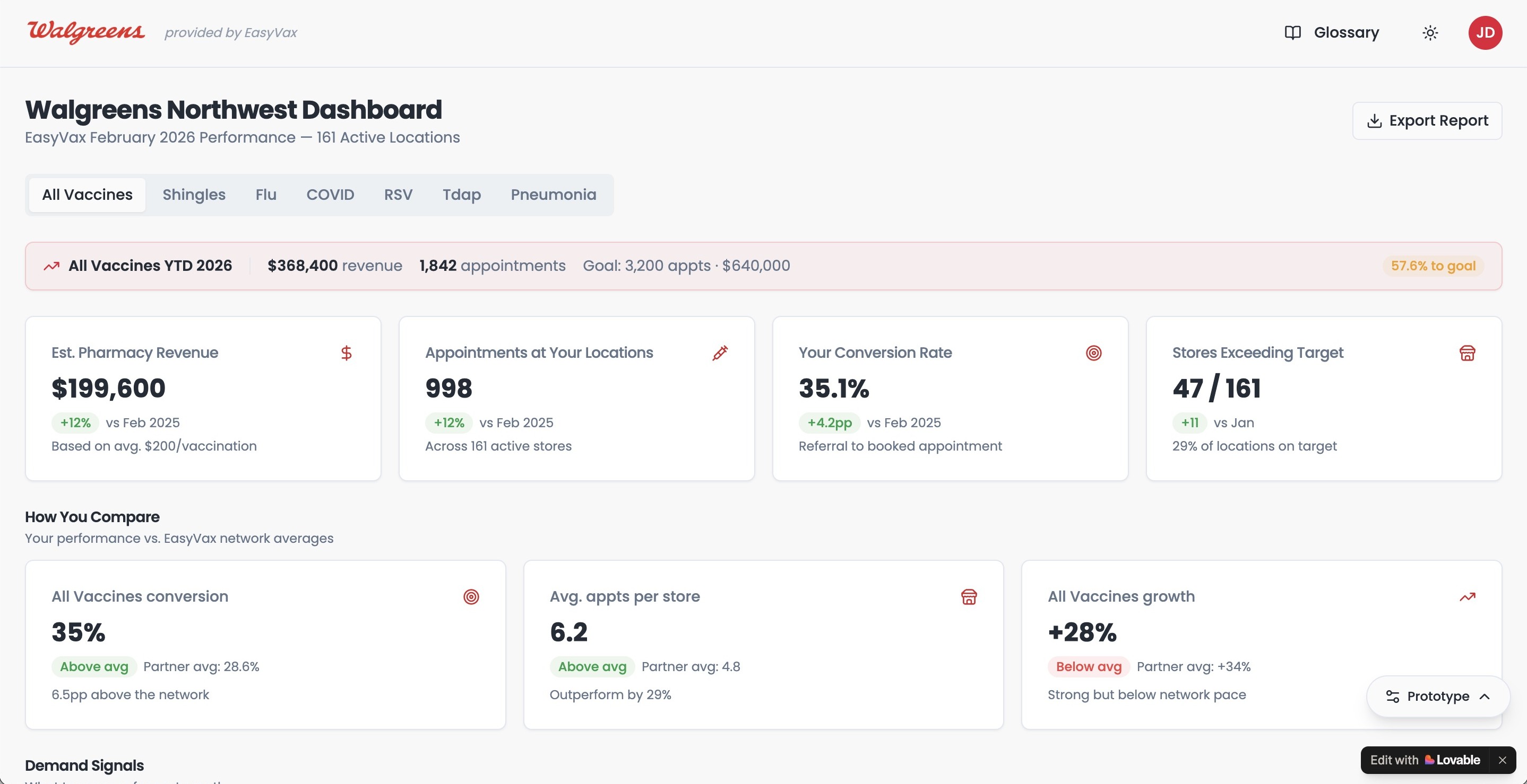
I led the UX for an AI-generated insights dashboard for a global healthcare brand, working closely with engineering and data science to turn complex industry data into a clear, decision-ready interface for executives and operations teams.
An AI system was generating valuable healthcare insights, but the raw output wasn't usable by the people who needed it. Executives and operations teams were still relying on manual reporting cycles because they couldn't trust or interpret what the AI was surfacing.
Senior UI/UX Designer leading end-to-end UX for the dashboard. I worked closely with engineering, data science, and client stakeholders to figure out which insights to surface, how to structure them, and how to make them feel trustworthy and actionable.
A real-time dashboard that replaced a multi-day manual reporting cycle. Executives and operations leads shifted from weekly PDF reports to daily dashboard use, with time-to-insight dropping from days to minutes.
How I approached it
The design work for a tool like this happens long before anyone opens a chart library. It starts with understanding what people actually need to know.
Understand the actual users
Interviews with executives, ops leads, and analysts to learn what decisions they were trying to make and where they were losing time waiting on information.
Establish information hierarchy
Mapped AI-generated outputs by how often each insight got acted on: what surfaces at a glance, what's one click away, what belongs in drill-down detail.
Design for AI transparency
Confidence indicators, data source labels, and plain-language explanations so users understood not just the insight, but how the AI got there.
Iterate with real users on real data
Live walk-throughs with the same executives and ops leads, using actual client data, until the dashboard answered their first three questions without scrolling.
Decisions that mattered
Making AI outputs feel trustworthy, not just present
Healthcare executives weren't going to act on an insight they didn't understand. Every AI-generated output got a plain-language explanation, a confidence indicator, and a clear data source label, because the "why" mattered as much as the insight itself.
One primary question per view
The temptation in any data-heavy product is to surface everything you have. We held firm on focus: each view answers one primary question clearly, with supporting detail one click away.
Designing empty and low-confidence states as carefully as loaded ones
In a healthcare context, a dashboard that goes silent without explanation is genuinely dangerous. Empty states and low-confidence outputs got first-class design treatment, because those are the moments trust holds or breaks.
What changed
Specific impact data is shared in the full case study Public-facing highlights:
Time-to-insight dropped from a multi-day manual reporting cycle to real-time dashboard access. Executives stopped waiting on weekly PDFs and started checking the dashboard as part of their daily routine.
Operations teams stopped running parallel spreadsheets to validate what the AI was surfacing. The dashboard became the source of truth, which was the clearest signal the trust problem had been solved.
Post-launch interviews with the client team showed self-reported time-to-decision dropped meaningfully, and users described feeling more confident acting on insights compared to the prior reporting process.
The visual system and design patterns were built to hold up as new AI outputs, new data sources, and new user roles got added. The client team has continued expanding the dashboard without needing to redesign the foundation.
Working with complex data? Let's talk.
I love talking about design and hard problems. Drop me a line or connect on LinkedIn. I'd genuinely love to hear from you.