Nest’s Schedule Has Never Heard Of Its Own Dial
A redesign of the Google Nest scheduling flow that reuses the dial people already know, so setting a week of temperatures feels like setting one.
Two taps to change the temperature. A different app to schedule it.
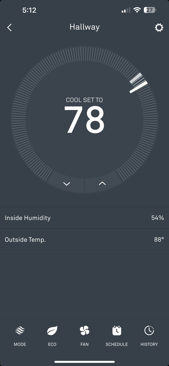
As a Nest user, I can change the temperature in seconds. But tapping Schedule turns the phone sideways into a blank grid that works nothing like the dial.
Adding a temperature means finding a small text link, dragging a bubble along a crosshair, and repeating the whole thing in a separate schedule for heating.
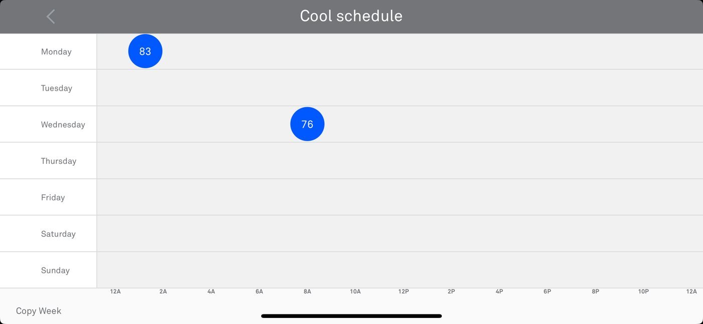
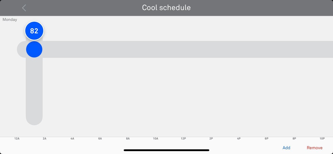
The rest of the app is portrait. Scheduling is the only place the phone has to turn.
“Add” and “Remove” are text links well under the 44 × 44 px minimum, in the corner farthest from a thumb.
Two separate schedules, with no way to set a heat-and-cool range for part of the day.
Dragging bubbles on a crosshair shares nothing with the dial people use every day.
Make the schedule feel like the thermostat
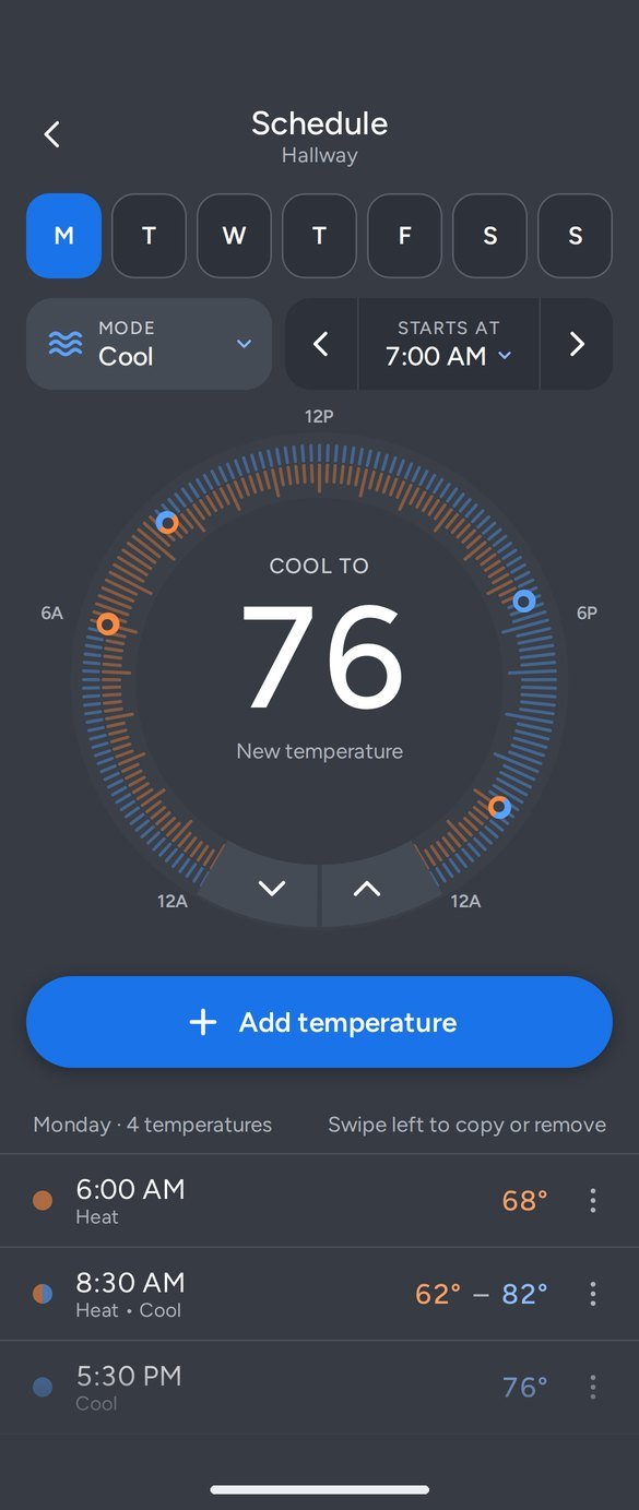
Reuse the ring, chevrons, and big number from the home screen.
Every control meets the minimum touch target, most go well past it.
Works held upright or turned sideways. The layout adapts instead of forcing a turn.
Nest’s slate background, orange for heat and blue for cool.
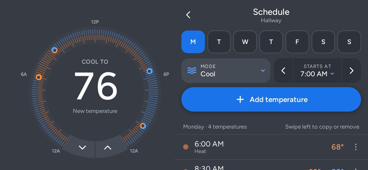
The dial becomes a 24-hour clock
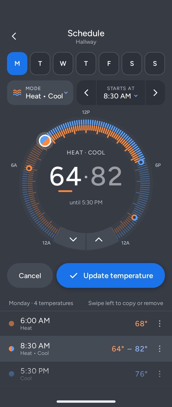
The ring maps the day from midnight at the bottom left, through noon at the top, to midnight at the bottom right. Each scheduled temperature is a dot you can tap, drag, or place by tapping anywhere on the ring.
The chevrons at the bottom work exactly like they do on the home screen. Mode and start time sit in one row above the dial, away from the ring so older users can hit them without touching the dial by accident.
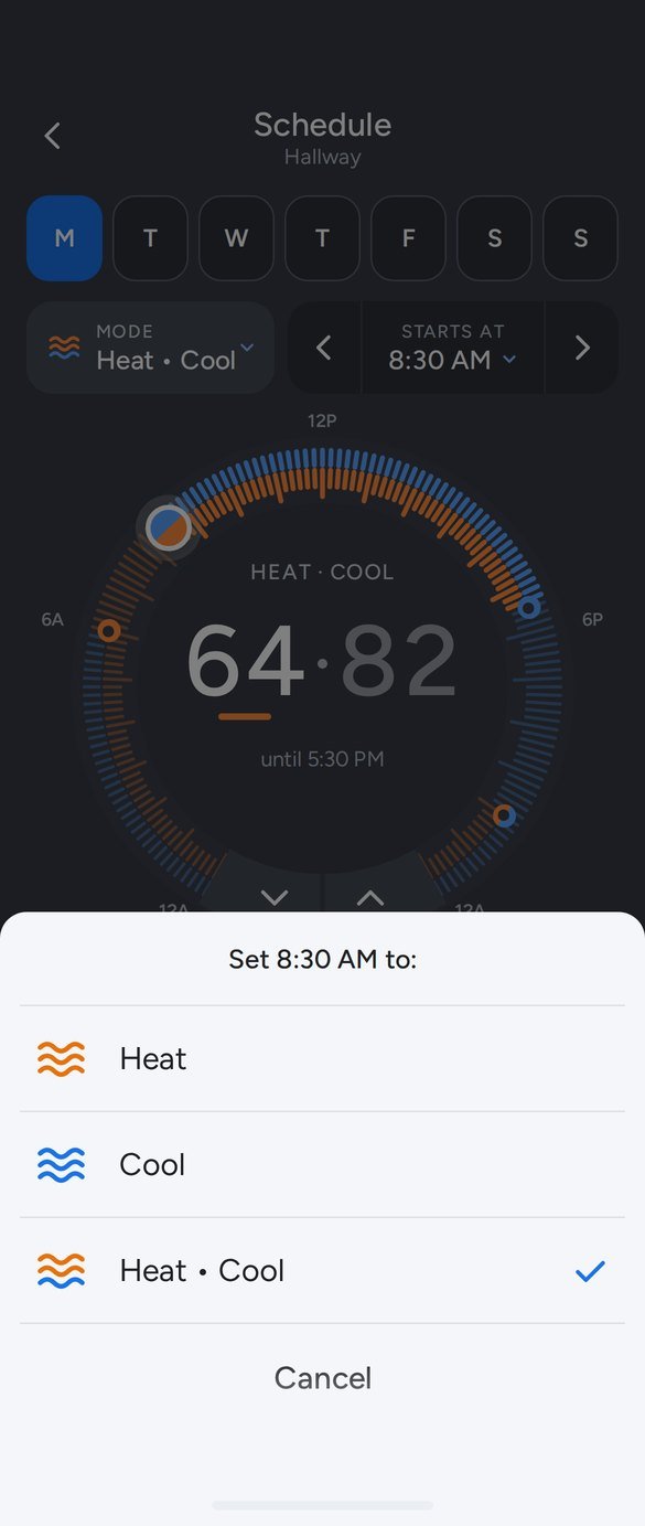
Each temperature keeps its own mode, so a day can mix Heat in the morning, a Heat • Cool range during the day, and Cool at night.
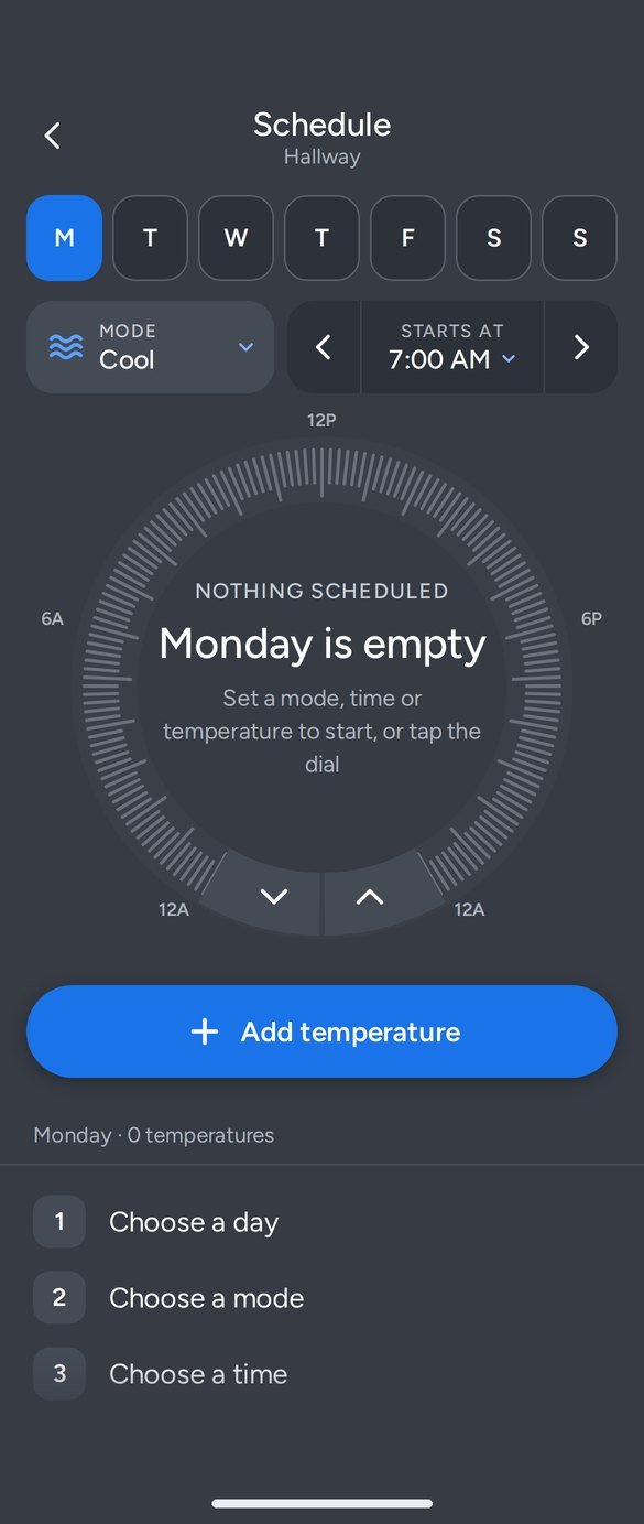
The dial sets temperature. Time becomes a timeline.
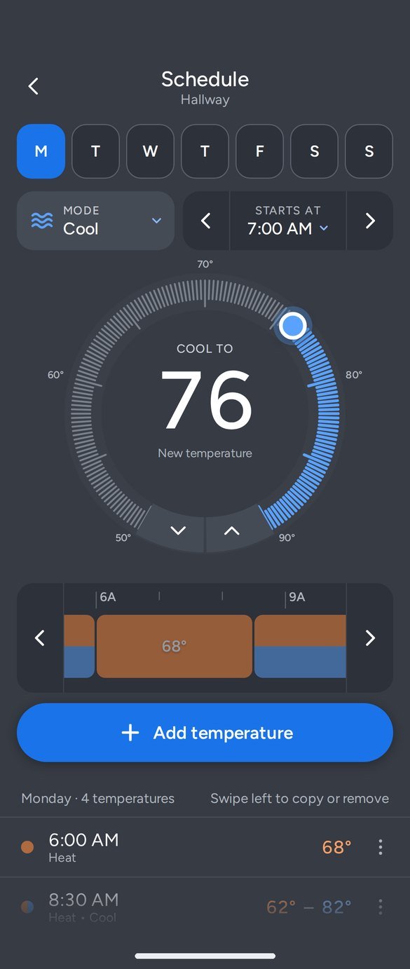
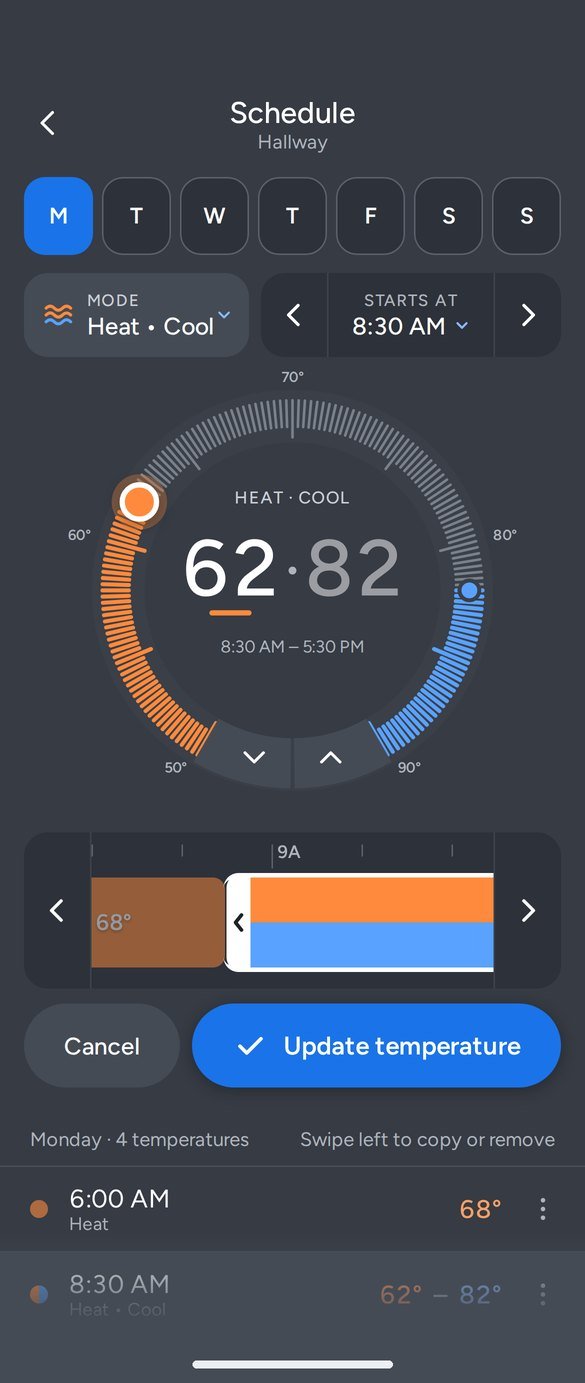
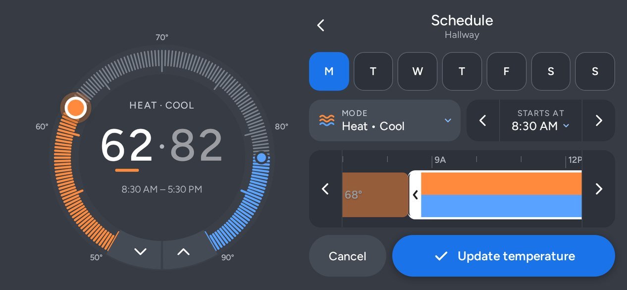
The second direction keeps the dial for what people already use it for: temperature. The day moves into a scrollable timeline, one hour per 60 px, so each 15-minute step is a real distance for a finger.
Selecting a block puts a trim frame around it, borrowed from how people cut a video on their phone. Handles stop before they run into a neighbor, and they respond to arrow keys for anyone not using touch.
Upright or sideways
The old schedule only worked sideways. The redesign works either way: turn the phone and the dial stays pinned on the left while the day, mode, time, and list move to the right. Sheets and dialogs center on screen so they never stretch edge to edge.
Try it
These are the working prototypes, upright and sideways. Tap a day, drag a dot around the dial, open the mode menu, swipe a row left, or scroll Option B’s timeline.
Open full size
Open full size
Open full size
Open full size
Open full size
Open full size
How the design changed
I built the prototype and then worked through it screen by screen. These are the changes that mattered most, in the order I made them.
- 1Add became the primary action
The first version had Add, Remove, and Copy in a bottom bar. Add moved to a full-width button under the dial; Copy and Remove moved to a swipe on each row, with a ⋯ button for anyone who can’t swipe.
- 2Selected vs. scheduled dots
The dot being edited became larger and filled, with a glow. Scheduled dots became small rings, so the two never look alike.
- 3Tried full-screen mode color, then reverted
A full orange background matched Nest’s heating screen, but white small text on that orange measured about 3.1:1, below the 4.5:1 standard. The slate background came back and color moved to the dial.
- 4One button color
A half-orange, half-blue button for Heat • Cool was hard to read. Every call to action now uses one blue, and orange and blue only ever mean heat and cool.
- 5Modes per temperature
Switching modes used to swap the whole schedule. Now each temperature keeps its own mode, and switching only changes the one being edited.
- 6Time controls off the dial
Arrows inside the ring were too close to it for older users. They moved to a Starts At control, with a dropdown of every time and any time allowed.
- 7Add vs. Update
Tapping a scheduled temperature now switches the button to Update, with Cancel. Leaving with unsaved changes asks first: Save, Discard, or Keep editing.
- 8“Setpoint” became “temperature”
Setpoint is an HVAC term. Temperature is what people picture: “68 at 6 AM.”
Built for thumbs, screen readers, and older eyes
Nest’s heating orange behind white body text measures about 3.1:1. That’s fine for the big temperature number, but below the 4.5:1 AA minimum for small text, which is why the redesign keeps the slate background.
What I would test next
A vs. B
A task-based test with current Nest owners: build a weekday schedule in each direction and compare time and errors.
Older users
Check reach, tap accuracy, and label size with people over 65, the group most likely to struggle with the current grid.
Copying days
Most households repeat weekdays. Test whether “Copy to weekdays” should appear right after the first day is set up.